A case study on data visualization, environmental awareness, and the technical decisions behind a React dashboard built to make AI’s hidden costs visible.
Why this project exists
AI is scaling fast. But the environmental cost of that scaling — electricity, water, physical infrastructure — is mostly invisible to the people building and using these systems.
The goal was simple: make the hidden costs visible. Not with false precision, but with credible, comparable magnitudes that give developers and decision-makers a real mental model to work with.
The result is an interactive dashboard that lets users explore AI energy consumption across sectors, workloads, geographies, and model lifecycle stages.
Tech stack
The project uses a modern, lightweight frontend stack optimized for fast iteration and component reusability:
- React 19 — component architecture
- Vite — fast dev/build tooling
- Tailwind CSS — consistent design system
- Recharts — data visualization
- react-simple-maps (React 19 fork) — geographic rendering
No backend, no API calls. All datasets are bundled locally — which eliminates loading states, network failures, and CORS issues, and keeps the app deployable as a static site.
Architecture & component design
The app follows a strict separation of concerns: data lives in /data, UI logic in /components. Each chart is a self-contained module that supports two rendering modes:
// Compact mode — rendered in dashboard card preview
<EnergyGrowthChart mode="compact" />

// Full mode — opened in modal on interaction
<EnergyGrowthChart mode="full" filters={activeFilters} />
State is shared between card and modal via a single source of truth, so applied filters persist when a user drills into a chart. This progressive disclosure pattern kept the dashboard scannable at a glance while still supporting depth on demand.
Dashboard modules
- AI vs Other Sectors
- AI Energy Growth over time
- Data Centers by Region
- Training vs Inference breakdown
- Energy per AI Task (text, image, video, audio)
- Water Consumption (cooling requirements)
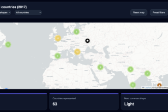
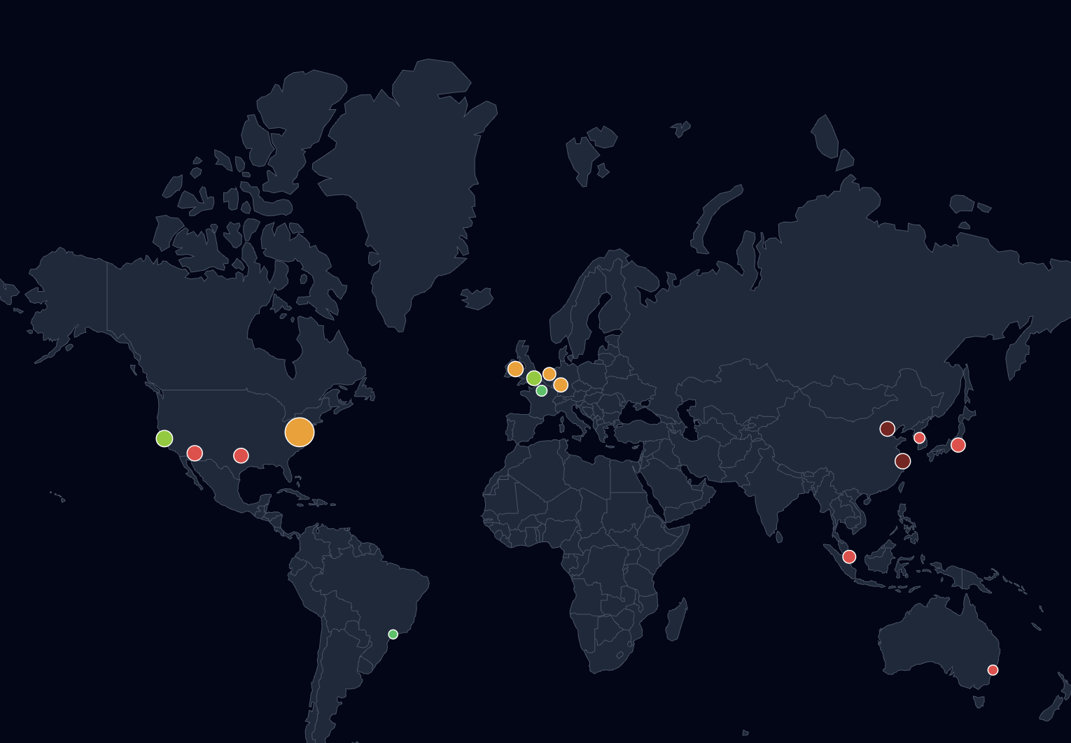
- Global Data Center Map
- LLM Lifecycle educational diagram
Technical challenges & how we solved them
1. React 19 library incompatibility
Problem: The official react-simple-maps package wasn’t compatible with React 19, breaking map rendering entirely at build time.
Solution: Switched to a community-maintained React 19 fork. We also loaded GeoJSON/TopoJSON assets locally instead of fetching them via URL, which eliminated a whole category of asset loading failures and improved reliability.
2. Map projection & marker alignment
Problem: Projection distortions and tooltip misalignment on resize made the world map unusable on smaller viewports — markers drifted from their actual coordinates when the container resized.
Solution: Fixed geoMercator projection scaling explicitly rather than relying on defaults. Rebuilt tooltip positioning as an overlay relative to the SVG viewport rather than using absolute screen coordinates.
Key learning: Map rendering is less about data — and more about projection math and layout behavior. Budget more time for it than you think you need.
3. Incomplete public data
Problem: No single comprehensive public dataset exists for AI energy consumption. Values vary significantly across sources, and many figures are estimates or extrapolations.
Solution: Combined data from IEA, EPRI, Big Tech sustainability reports, and academic research. Normalized everything to consistent units (TWh/year, Wh per task, liters per task). Used scenario-based modeling to fill gaps — and made the uncertainty explicit in the UI rather than hiding it.
The goal was never perfect accuracy. It was credible and comparable magnitudes.
URL state & shareability
A key feature is the ability to share a specific chart view via URL — for example, /?chart=ai-vs-sectors. This makes it easy to embed a specific visualization in articles, link from Slack threads, or reference in presentations.
// Sync active chart to URL query param
const setChart = (id) => {
  history.replaceState(null, '', `?chart=${id}`);
  setActiveChart(id);
};

// Read initial state on load
const params = new URLSearchParams(window.location.search);
const initial = params.get('chart') || 'ai-vs-sectors';
Low-effort to implement, high-value for shareability — especially in team or editorial contexts.
Performance decisions
- No API calls — all datasets are bundled locally. Fast initial load, no network dependency.
- useMemo for computed values — filtered and aggregated datasets are memoized to avoid recalculating on every render, especially for charts with user-controlled filters.
- ResponsiveContainer (Recharts) — charts resize reactively with no manual resize listeners or
windowevent handlers. - Mobile simplification — reduced dataset size and simplified labels on narrow viewports, detected via a breakpoint hook so chart complexity also scales down, not just layout.
Accessibility
Accessibility was treated as a core feature, not an afterthought. Every interactive element supports:
- Full keyboard navigation — Tab, Enter, Escape
- Focus trapping inside modals
- ARIA roles and labels
- Keyboard-triggered tooltip panels (not hover-only)
- Contrast ratios validated across the full palette
What the data tells us
A few standout findings from building and exploring the dashboard:
- Training is dramatic, inference is the real cost. Training costs are large and memorable, but at scale, inference accumulates the actual long-term energy footprint.
- Workload type matters enormously. Video generation consumes roughly 700× more energy than a text query. The “AI task” is not a homogeneous unit.
- Location has a 4× carbon impact. The same compute workload can have radically different carbon intensity depending on where the data center is located and what energy mix it uses.
The biggest insight wasn’t technical — it was narrative. Training costs are what people talk about. Inference is where the environmental story actually plays out at scale.
What we’d do differently
A few honest trade-offs made during development:
- Data sourcing transparency should be first-class. The methodology behind each estimate should be surfaced directly in the UI, not buried in a footnote. Users need to trust the numbers before they’ll act on them.
- SVG maps are expensive on mobile. A canvas-based fallback for low-power devices would be worth the added complexity. The current implementation struggles on older phones.
- Scenario simulation is the obvious next step. Static estimates are useful, but users immediately want to ask “what if AI energy grows 30% per year?” — a slider-driven simulation mode would make the dashboard significantly more valuable.
Conclusion
Good data visualization isn’t about charts — it’s about helping people understand systems they can’t see directly.
The engineering here is relatively straightforward. The harder problems were all in data modeling, narrative structure, and deciding what to leave out. If you’re building something similar, invest early in your data layer. Charts, interactions, and layout are all easy to iterate on. The underlying data model is not.
The dashboard is live at parallel-perspectives.com.