Mapping 118 Years of UFO Sightings: An Interactive Dashboard
Over 147,000 reported encounters. 118 years of testimonies. One interactive map. I built a dashboard that lets you explore UFO sighting reports from 1905 to 2023, filter by year, shape and country, and visualise global patterns across time. You can explore it here: UFO Sightings Dashboard.
What the data is — and what it isn’t
Before diving into the numbers, an important caveat: this data has no scientific value. Every record in this dataset is a personal testimony submitted to NUFORC (National UFO Reporting Center), a US-based organisation that has been collecting reports of unidentified aerial phenomena from around the world since 1974. These are self-reported sightings, unverified, uncorroborated, and subject to all the biases that come with human perception and memory.
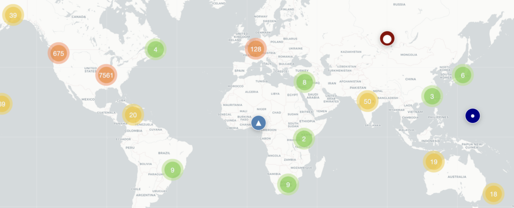
The dataset is also heavily skewed toward North America. The vast majority of the 147,890 records come from the United States and Canada, simply because NUFORC is an American organisation with an English-language reporting system. Europe, Asia, Africa and South America are dramatically underrepresented — not because fewer people see unexplained things in the sky, but because fewer people report them through this particular channel. Any global pattern you observe in this dashboard should be read with that bias firmly in mind.
That said, the data is genuinely fascinating as a cultural and sociological artifact. It tells us a great deal about how people perceive, describe, and report unusual experiences — and how that changes over time.
What the numbers show
147,890 sightings spanning 118 years paint a striking picture when mapped and charted. A few patterns stand out immediately.
Reports explode after 2000. The pre-2000 dataset is relatively sparse, with sightings in the hundreds per year. After 2001 the numbers climb sharply, peaking in 2014 with the highest single-year count in the entire dataset. This almost certainly reflects the rise of internet reporting rather than an actual surge in aerial phenomena — NUFORC launched its online submission form in the late 1990s, and smartphone cameras made people more likely to document and report what they saw.
“Light” is by far the most reported shape, followed by “circle.” This is worth pausing on. When someone sees an unexplained light in the night sky, the shape is almost impossible to determine — yet “light” itself becomes the category. The dominance of this shape suggests that most sightings are distant, nocturnal, and ambiguous rather than close-range encounters with clearly defined craft. “Circle” and “sphere” following close behind reinforces this: these are the shapes humans naturally assign to point-source lights.
North America dominates entirely. The United States accounts for the overwhelming majority of records, with Canada second. This is the starkest bias in the dataset and worth flagging clearly: a European or Asian equivalent database would look completely different. The dashboard does include international reports — from France, the UK, Australia, and elsewhere — but they represent a small fraction of the total.
Sightings cluster in summer months, particularly July and August. This likely reflects a simple behavioural pattern: people spend more time outside at night in summer, so they see more things in the sky. It may also correlate with increased air traffic, drone activity, and astronomical events during warmer months.
Most sightings involve a single observer. The observer distribution shows a sharp drop from 1 to 2+ witnesses. Solo sightings are harder to verify but also more likely to be reported, since a lone witness has no one to confer with or be embarrassed in front of.
How it was built
The dashboard is built in React with Leaflet for the map, Recharts for the charts, and Tailwind CSS for styling. The underlying data comes from a NUFORC dataset on Hugging Face, preprocessed into a lean JSON format — stripping long witness narratives to keep the file manageable — and geocoded using the Nominatim API (OpenStreetMap) to generate coordinates from raw location strings like “Huntsville, TX, USA.”
The geocoding step was the most technically interesting part of the build. NUFORC location strings are inconsistently formatted — some follow a clean “City, State, Country” pattern, others include parenthetical region hints like “Soulatge (near St. Paul) (France), , France” — requiring a cleaning pass before geocoding. Roughly 90% of the ~7,000 unique locations resolved successfully.
What to make of all this
Treat this dashboard as a window into collective human experience rather than evidence of anything extraterrestrial. The patterns it reveals — the surge after internet adoption, the summer clustering, the dominance of ambiguous light-shapes — are more sociological than astronomical. They tell us how many people look up at the sky and see something they can’t immediately explain, and feel compelled to report it.
Whether that something is a drone, a weather balloon, a satellite, a military aircraft, or something else entirely is a question this data cannot answer. What it does show is that the impulse to look up, wonder, and share that wonder is remarkably widespread — and has been for well over a century.
Explore the dashboard for yourself and see what patterns you notice.